2 posts tagged with "conversion rate optimization"

View All Tags

App Quality Score (QS): Why Mobile Teams Need More Than Apdex to Measure Release Health

Published: · 11 min read
Andrea Sunny
Marketing Associate, Appxiom

For years, Apdex (Application Performance Index) has been a standard metric for measuring application responsiveness. Popularized by Application Performance Monitoring (APM) platforms, Apdex helps engineering teams understand whether application response times meet predefined performance thresholds. It is an effective indicator of infrastructure and backend performance.

However, mobile app quality extends far beyond response time.

An app can maintain an excellent Apdex score while users still experience crashes, ANRs, frozen screens, memory issues, or UI failures that prevent them from completing important tasks. These problems may not affect server latency, but they significantly impact user experience, release stability, and customer retention.

To bridge this gap, Appxiom introduces Quality Score (QS) - a version-level metric that provides a holistic view of application health by combining signals from crashes, performance issues, stability problems, and other quality indicators into a single score.

Alongside Quality Score, Appxiom also provides Goal Friction Impact (GFI), a complementary metric that measures how technical issues disrupt specific user journeys such as signup, login, checkout, or onboarding.

Together, these metrics help teams answer two equally important questions:

In this article, we'll explore why traditional performance metrics like Apdex are no longer sufficient for evaluating mobile application quality and how Appxiom's Quality Score provides a more complete picture of release health.

Why Apdex Is Necessary - But Not Sufficient for Product Teams

Apdex measures application responsiveness against a predefined performance threshold (T), helping teams understand whether users experience acceptable response times.

It classifies requests into three categories:

  • "Satisfied:" Response time ≤ T
  • "Tolerating:" T < Response time ≤ 4T
  • "Frustrated:" Response time > 4T or request failures

For infrastructure and backend monitoring, this works extremely well.

What Apdex Measures Effectively

Apdex provides valuable insights into system performance, including:

  • Backend and API response times
  • Infrastructure latency
  • Service availability
  • Performance regressions
  • SLA and SLO compliance

These metrics help engineering teams identify slow services and maintain application responsiveness.

What Apdex Doesn't Measure

While response time is important, it represents only one aspect of application quality.

Modern mobile applications frequently experience issues that have little or no impact on server latency but significantly affect user experience.

Examples include:

  • Application crashes
  • ANRs (Application Not Responding)
  • App hangs
  • Frozen frames
  • Memory-related issues
  • UI rendering problems
  • Broken user interactions
  • Startup failures

A payment screen may load instantly but crash when the user taps Pay.

A signup form may respond within milliseconds but fail because of an unexpected client-side validation error.

An application may achieve an excellent Apdex score while users continue abandoning critical workflows due to stability and usability issues.

These problems directly affect application quality, even though traditional performance metrics report everything as healthy.

This is where version-level quality metrics become essential.

The Business Blind Spot: When Apdex Is Green but Application Quality Is Declining

Consider a typical mobile application after a new release:

  • Weekly Active Users: 500,000
  • Apdex Score: 0.96 (Excellent)
  • 95th Percentile API Response Time: 180 ms
  • Server Availability: 99.98%
  • Infrastructure Alerts: 0

From an infrastructure perspective, the release looks nearly perfect.

But here's what users are actually experiencing:

  • 3,200 users encountered app crashes.
  • 1,850 users experienced ANRs while opening key screens.
  • 4,700 users faced frozen frames and UI responsiveness issues.
  • 2,100 users couldn't complete onboarding because of a client-side validation bug.
  • 1,400 users abandoned checkout after a payment screen failure.

In total, more than 13,000 users experienced quality issues - even though Apdex reported an excellent score.

Traditional performance metrics don't capture these client-side failures because response times remain within acceptable limits. As a result, engineering teams may assume a release is healthy while application quality steadily declines across real user devices.

This disconnect becomes even more significant as applications expand across multiple operating systems, device models, and release versions. Infrastructure metrics reveal how quickly systems respond, but they don't indicate whether a release is becoming more stable - or introducing new quality issues.

This is where Appxiom Quality Score (QS) fills the gap. By continuously evaluating the health of every app version, Quality Score enables teams to compare releases, detect quality regressions early, and understand whether application stability is improving over time.

While Quality Score provides the overall health of a release, Goal Friction Impact (GFI) complements it by identifying how those technical issues affect critical user journeys such as signup, login, onboarding, and checkout.

Together, they provide a complete view of both release quality and business impact.

Understanding Appxiom Quality Score (QS)

As mobile applications become increasingly complex, evaluating release quality requires more than monitoring crashes or response times in isolation. Engineering teams need a single metric that reflects the overall health of every application version.

Appxiom Quality Score (QS) is designed to provide exactly that.

Quality Score is a version-level health metric that continuously evaluates the stability, reliability, and overall quality of an application release. Instead of analyzing individual issues separately, QS combines multiple quality signals into a single score, allowing teams to quickly understand whether an app version is improving or degrading over time.

Rather than asking:

"How many crashes occurred?"

Quality Score answers:

"How healthy is this release compared to previous versions?"

This enables engineering, QA, and product teams to compare releases at a glance and identify quality regressions before they affect a larger percentage of users.

What Contributes to Quality Score?

Quality Score considers multiple indicators of application health, including:

  • Application crashes
  • ANRs (Application Not Responding)
  • App hangs
  • Frozen frames
  • Memory-related issues
  • UI responsiveness problems
  • Startup failures
  • Network and API issues
  • Other stability and performance indicators

Instead of reviewing each metric independently, Appxiom aggregates these signals into a single Quality Score for every application version.

Why a Single Quality Score Matters

Without a consolidated quality metric, engineering teams must manually compare crashes, ANRs, frozen frames, memory issues, and startup failures across every release. Quality Score simplifies this process by summarizing overall release health into a single metric, making it easier to identify regressions and prioritize investigation.

Quality Score Dashboard: Understanding Release Health at a Glance

One of the biggest challenges in release management is understanding the health of multiple app versions without manually analyzing dozens of performance metrics.

The Appxiom Quality Score Dashboard simplifies this by presenting a consolidated view of every release, allowing engineering and product teams to identify quality trends within seconds.

Instead of reviewing crashes, ANRs, memory issues, and performance metrics separately, teams can immediately compare the quality of every application version using a single score.

The dashboard provides visibility into:

  • Quality Score for every application version
  • Affected Installations experiencing quality issues
  • Total Issue Occurrences detected in each release
  • Historical Quality Score Trends
  • Quick access to issues impacting each version

This enables teams to answer important release questions immediately:

  • Which release is currently the healthiest?
  • Did application quality improve after the latest deployment?
  • Which version introduced the highest number of quality issues?
  • Which release should be prioritized for investigation?

Instead of spending hours correlating multiple dashboards, teams can quickly identify release regressions and focus on the versions that require immediate attention.

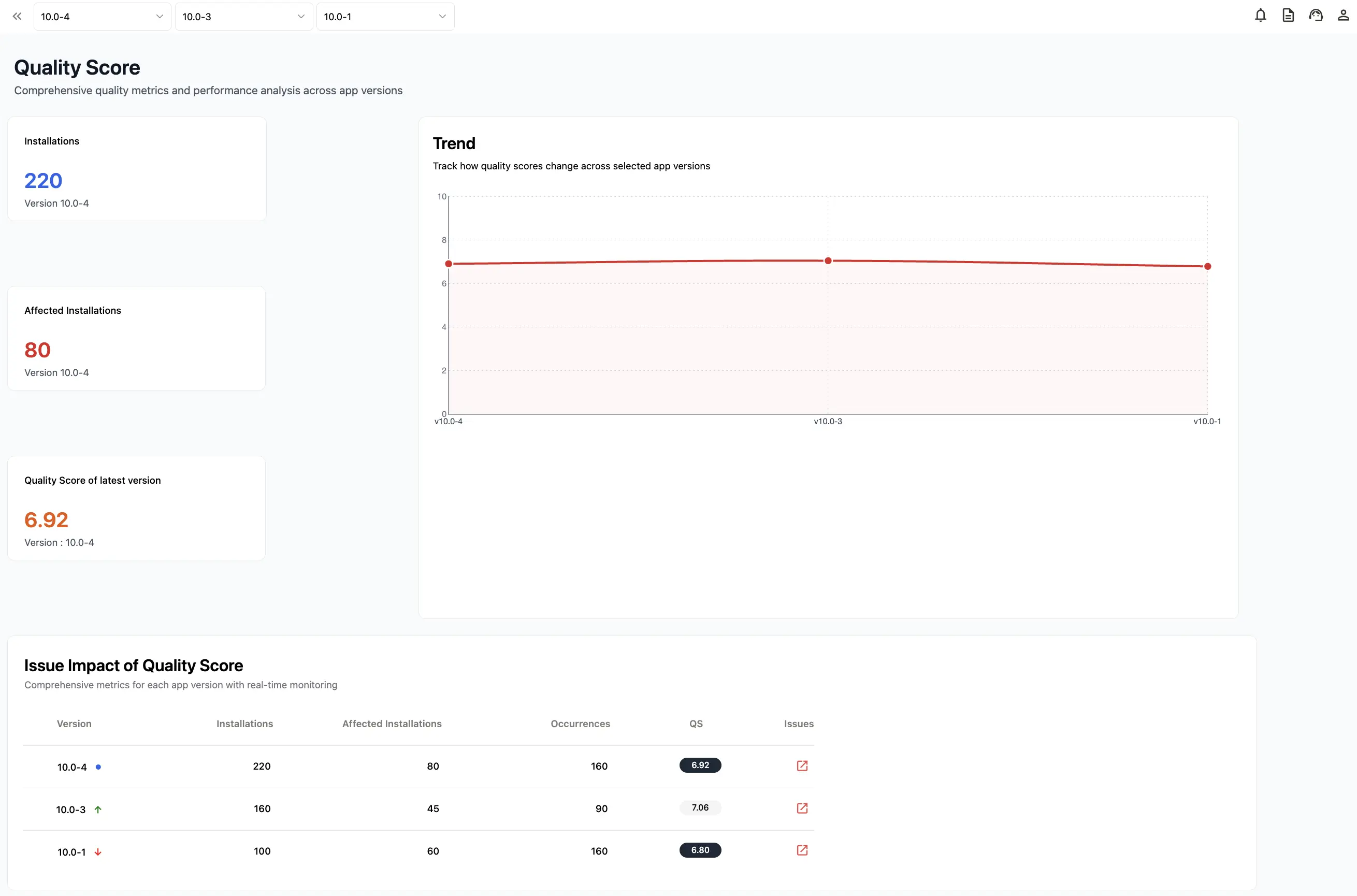
Appxiom Quality Score Dashboard

Example

In the dashboard below, each application version is assigned its own Quality Score, along with the number of affected installations and total issue occurrences.

This makes it easy to compare release health over time. A declining Quality Score immediately signals that the latest release may have introduced stability or performance regressions, allowing teams to investigate before issues affect a larger portion of users.

Quality Score vs. Apdex vs. Goal Friction Impact

While Quality Score provides a comprehensive view of release health, it isn't designed to replace traditional performance metrics like Apdex or user journey metrics like Goal Friction Impact (GFI). Each metric answers a different question about your application.

CapabilityApdexQuality Score (QS)Goal Friction Impact (GFI)
Primary FocusInfrastructure performanceOverall application qualityHealth of individual user journeys
ScopeBackend services and APIsEntire application versionSpecific goals like signup, login, checkout
MeasuresResponse time satisfactionStability, reliability, and qualityFriction caused by technical issues during user journeys
Primary UsersDevOps, SREEngineering, QA, ProductProduct Managers, Growth Teams
AnswersIs the system fast?Is this release healthy?Which user journeys are affected the most?

Rather than competing with one another, these metrics work together to provide a complete understanding of application health - from infrastructure performance to release stability and user experience.

How Goal Friction Impact Complements Quality Score

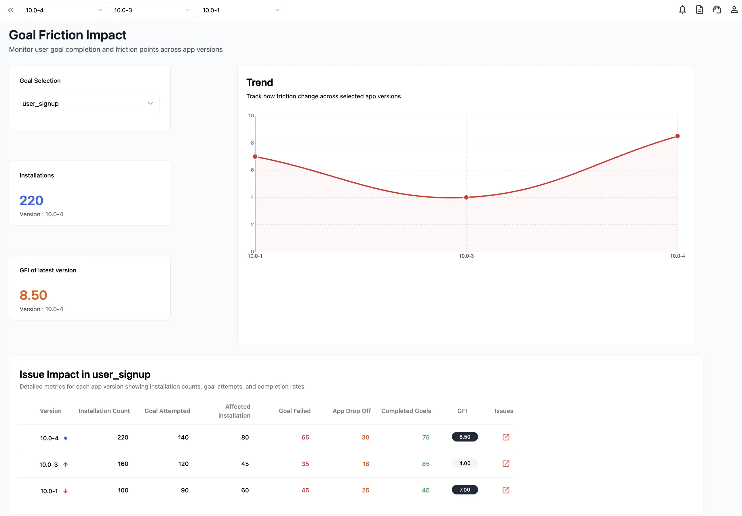
Appxiom Goal Friction Impact Dashboard

Quality Score provides a version-level view of application health, making it easy to compare releases and identify stability regressions.

However, even when two releases have similar Quality Scores, the user experience may differ significantly depending on where the issues occur.

For example, a release with minor UI glitches across multiple screens may receive a similar Quality Score to one where a payment failure affects only the checkout journey. While both releases require attention, their business impact is very different.

This is where Goal Friction Impact (GFI) complements Quality Score.

Instead of evaluating the overall health of an application version, GFI focuses on individual user journeys such as signup, login, onboarding, and checkout. It helps teams identify which business-critical goals are experiencing the highest friction, enabling faster prioritization of issues that directly affect user success.

Together, these two metrics provide a more complete view of application quality:

  • Quality Score answers "How healthy is this application release?"
  • Goal Friction Impact answers "Which user journeys are being disrupted?"

By combining both perspectives, engineering and product teams can prioritize fixes based not only on technical severity but also on their impact on the overall release and the user experience.

In our next article, we'll take a deeper dive into Goal Friction Impact (GFI), exploring how it measures friction across user journeys and helps teams prioritize issues based on real business impact.

Release Health: Connecting Code Changes to Usability

Quality Score becomes even more valuable when tracked across consecutive releases. By comparing scores over time, engineering teams can quickly identify regressions, validate the impact of bug fixes, and measure whether application quality is improving with each deployment. Instead of reviewing dozens of individual metrics after every release, teams can use Quality Score as a consistent benchmark for release health.

Business Benefits of Quality Score

By monitoring Quality Score, engineering and product teams can:

  • Detect release regressions earlier
  • Compare application quality across versions
  • Validate the impact of bug fixes
  • Improve collaboration between engineering, QA, and product teams
  • Release updates with greater confidence

Quality Score provides a consistent benchmark for measuring application health instead of relying on isolated crash reports or individual performance metrics.

Best Practices for Using Quality Score

To get the most value from Quality Score:

  • Monitor every release: Track Quality Score after every deployment to identify unexpected regressions early.
  • Compare versions regularly: Review Quality Scores across consecutive releases to measure improvements and validate engineering efforts.
  • Investigate declining scores: A lower Quality Score should prompt deeper analysis into crashes, ANRs, memory issues, and other quality indicators contributing to the decline.
  • Use Quality Score alongside other metrics: Quality Score provides an overall view of release health. Pair it with infrastructure metrics such as Apdex for system performance and Goal Friction Impact (GFI) for understanding how technical issues affect critical user journeys.

Conclusion

Traditional performance metrics like Apdex remain essential for monitoring infrastructure responsiveness, but they provide only part of the picture. Modern mobile applications require a broader understanding of release quality - one that considers stability, reliability, and the overall user experience.

Appxiom's Quality Score (QS) provides that broader perspective by combining multiple quality indicators into a single version-level metric. Instead of reviewing crashes, ANRs, performance issues, and stability metrics separately, engineering teams can quickly evaluate the health of every application release, compare versions, and identify regressions before they affect more users.

When used alongside infrastructure metrics such as Apdex and complementary insights from Goal Friction Impact (GFI), Quality Score helps engineering and product teams make faster, data-driven release decisions while continuously improving application quality.

If you'd like to explore these metrics in more detail, check out:

Ready to evaluate the quality of your own app?

Sign up for Appxiom and start monitoring your application's release health with Quality Score and Goal Friction Impact. Every new account includes a 30-day free trial, no credit card required, and cancel anytime - so you can explore the platform and see how Appxiom helps you detect, prioritize, and resolve quality issues before they impact your users.

Diagnosing Checkout Conversion Drops with Real-User Monitoring

Published: · 10 min read
Andrea Sunny
Marketing Associate, Appxiom

When a checkout conversion rate drops overnight, debates erupt. Marketing blames campaign quality. Engineering points to green graphs for uptime, p95 latency, and error budgets. The truth is usually hiding in plain sight: something in the user journey mapping is broken, even if your back end looks healthy.

This article shows how to use real user monitoring and outcome-centric analytics to uncover silent micro-failures that decimate conversions - problems like a payment button that clicks but never confirms due to a client-side validation error. We’ll compare traditional RUM approaches (e.g., Sentry and New Relic) that rely on manual tagging with Appxiom’s automated Goal Friction Impact (GFI), and we’ll walk through a step-by-step approach to diagnose conversion drops fast.

When conversions tank but everything looks green

  • Server-side APM shows green because back-end services are “up,” and median latency barely moved.
  • Marketing channels haven’t changed much, but you still see conversion drops.
  • The likely culprit: a front-end or mobile client defect causing user-visible friction that never throws a server exception - e.g., a disabled “Pay” button never re-enables after a validation error, a mobile ANR during card tokenization, or a state mismatch after the app resumes from background.

Traditional monitoring often misses these. What’s needed is precise user journey mapping - tying technical issues to steps in the checkout user flow so you can answer, with data: why is app conversion dropping?

## Quantifying Revenue at Risk when Checkout Conversions Drop

Start by sizing the loss. Two numbers give you a board-ready estimate in minutes:

  • Conversion Rate (CR) = Orders / Sessions (or Checkout Starts)
  • Revenue at Risk = Sessions × (CR_before − CR_after) × Average Order Value (AOV)

Example:

  • Sessions this week: 500,000
  • CR_before: 2.8%
  • CR_after: 2.1%
  • AOV: $68

Revenue at Risk = 500,000 × (0.028 − 0.021) × $68 ≈ $238,000 per week

This frames urgency and aligns stakeholders on the cost of delay.

User journey mapping 101 for checkout funnels

Map the end-to-end user flow, then instrument each step and potential failure path.

Core funnel steps

  1. Product Viewed
  2. Add to Cart
  3. Checkout Start
  4. Shipping Submitted
  5. Payment Attempted
  6. Review/Place Order
  7. Order Completed

Friction points to tag

  • Validation errors (e.g., CVV invalid, postal code mismatch)
  • Button-state transitions (disabled → enabled)
  • Third-party SDK states (tokenization start/success/failure)
  • App lifecycle transitions (background/resume during payment)
  • Network state changes (offline/online at click time)
  • App hangs/ANRs and app logic errors that don’t crash

Example: Manual funnel instrumentation in RUM

Most RUM tools require explicit events and attributes to build funnel analysis. Here’s what that looks like.

New Relic (Browser): collect PageAction events and analyze with NRQL

// Instrument client-side events
newrelic.addPageAction('CheckoutStart', { cart_value: 89.99, items: 3 });
newrelic.addPageAction('ShippingSubmitted', { country: 'US' });
newrelic.addPageAction('PaymentAttempt', { provider: 'Stripe', method: 'card' });
newrelic.addPageAction('OrderCompleted', { order_value: 92.47 });

// Add useful attributes to all events
newrelic.setCustomAttribute('userTier', 'guest');

NRQL funnel query

SELECT funnel(
session,
WHERE actionName = 'CheckoutStart' AS 'Start',
WHERE actionName = 'ShippingSubmitted' AS 'Shipping',
WHERE actionName = 'PaymentAttempt' AS 'Payment',
WHERE actionName = 'OrderCompleted' AS 'Success'
)
FROM PageAction
WHERE appName = 'Shop Web'
SINCE 7 days AGO

Sentry (Web): create a transaction and tag spans for user actions

// Create a span for the checkout flow
await Sentry.startSpan(
{
name: 'checkout',
op: 'transaction',
},
async () => {
// Track a critical UI action
await Sentry.startSpan(
{
name: 'Payment button click',
op: 'ui.action',
attributes: {
amount: 89.99,
provider: 'stripe',
},
},
async () => {
// Payment logic goes here
}
);
}
);

These approaches work, but they depend on consistent manual tagging of business events and attributes across teams and app versions. In practice, that gap is exactly where hidden conversion-killers slip through.

References:

Traditional RUM vs outcome‑centric friction scoring

RUM shows you what happened in the browser or device. To fix revenue, you also need to know how friction impacted a goal like “purchase.”

Focus AreaSentry/New Relic RUM (typical)Appxiom Goal Friction Impact (GFI)
Primary lensSessions, timing, client errorsUser goals tied to business outcomes
Modeling funnelsRequires manual definition/tagging of events and attributesSelect a goal (e.g., Purchase) and see friction quantified
Issue scopeJS errors, resource timing, crashesCrashes, ANRs, hangs, logic bugs linked to goal failures
PrioritizationBy error frequency or slow endpointsBy failed goal attempts, drop-offs, affected installs, and revenue impact
ActionabilityInvestigations start from technical signalsInvestigations start from failed user goals with a 0–10 friction score

Appxiom’s GFI quantifies friction on a 0–10 scale using:

  • Goal Attempts
  • Failed Attempts
  • App Drop-Offs
  • Affected Installations

Scores above 5 are red flags that indicate significant conversion risk.

Learn more on the Goal Friction Impact product page: https://www.appxiom.com/which-bugs-cause-user-drop-off-in-apps

How to find silent micro‑failures that kill checkout

Below are high‑leverage checks that often reveal why conversion drops despite “green” back‑end dashboards.

Common micro‑failures and detection signals

  • Payment button disabled state never re-enables
    • Signals: High rate of PaymentAttempt events without follow‑up network calls; spike in UI action without success event
  • Client-side validation error not surfaced
    • Signals: Increased time on payment screen; elevated field error attributes; repeated focus/blur patterns
  • Third-party SDK hang or mobile ANR during tokenization
    • Signals: App Not Responding (ANR) occurrences on the payment activity/view; session abandonment immediately after click
  • Background/resume wipes payment state
    • Signals: App lifecycle resume events mid‑checkout followed by re-entry to earlier steps; repeated ShippingSubmitted without PaymentAttempt
  • Network change at confirm click
    • Signals: Offline detection at click time; queued client events not transmitted; retries without UX feedback
  • Currency/rounding or session mismatch
    • Signals: Recalculated totals mismatch (client vs server); 4xx from create‑payment‑intent; no on-screen error

A pragmatic triage checklist

  1. Plot the funnel and isolate the first step where a statistically significant delta appears week-over-week.
  2. For that step, split by client version, platform, device family, and geographies to localize the blast radius.
  3. Correlate with UX signals: button-state transitions, field-level errors, and lifecycle events.
  4. Inspect mobile ANRs/hangs around the payment view or SDK calls.
  5. Reproduce with device throttling and flaky network to surface latent race conditions.
  6. Prioritize fixes that reduce the largest cluster of failed attempts and drop-offs.

Pro tip

  • Pair funnel analysis with user session diagnostics. The combination of “where users drop” and “what the client did at that moment” is the fastest path to root cause.

Reference:

Where GFI changes the game

With Appxiom’s Goal Friction Impact, you start from the business outcome, not raw events.

What you see in the GFI dashboard

  • Goal selection: Choose “Purchase” (or any defined goal). Standard journeys like signup, login, and purchase are supported out of the box.
  • Installations & GFI score: Top cards show the active friction level by app version. For example, version 10.0-4 might show 26 installs with a GFI score of 6.12 - an immediate red flag.
  • Goal performance: Attempts, failed attempts, drop-offs, completions - already tied to the goal.
  • Version-specific insights: Drill into issue type and severity (e.g., an ANR in PaymentActivity), first/last seen, affected devices/OS versions/countries.
  • Quick actions: Push the issue to Jira directly from the dashboard and share a link with developers for rapid triage.

Why this matters

  • Aligns engineering with KPIs. You prioritize what measurably blocks purchases.
  • Surfaces silent failures. GFI captures crashes, ANRs, app hangs, and logic bugs - not just fatal exceptions.
  • Shortens time-to-fix. Teams jump straight to the code context that’s hurting conversions.

Explore GFI documentation for setup and workflows: /docs/gfi
See how to push friction issues into Jira from Appxiom: /integrations/jira

From “unknown drop” to “fixed” in 48 hours: a practical playbook

  1. Confirm impact
    • Compute Revenue at Risk. Share with stakeholders to align urgency.
  2. Select the Purchase goal in the GFI dashboard
    • Note the GFI trend by version. A spike from 4.0 to 6.1 after a new release suggests feature complexity introduced friction.
  3. Drill into version‑specific issues
    • Example: A major ANR reported in PaymentActivity on mid‑range Android devices in two countries.
  4. Validate hypothesis with session evidence
    • Cross‑check that PaymentAttempt starts but no success event follows; confirm session abandonment after a UI click.
  5. Create and assign work
    • Use “Push to Jira” to open a ticket with the stack trace, device/OS breakdown, and last‑seen timestamps.
  6. Ship the fix and verify
    • Watch the GFI score and failed attempts trend line in near real time; confirm a return toward baseline.
  7. Communicate the outcome
    • Tie GFI improvement to recovered conversion and revenue using the Revenue at Risk formula.

For pricing and plan details (GFI is included in Appxiom’s Professional Plan), visit: /pricing

KPIs to watch post‑fix

  • Checkout Completion Rate
  • GFI Score for the Purchase goal
  • Failed Attempts and Drop‑Offs per app version
  • Affected Installations count
  • p95/p99 time on payment screen and tokenization latency
  • Error distribution by device/OS and geography

Target

  • GFI trending toward 0–3 indicates healthy journeys; any score above 5 signals urgent friction.

Will Appxiom (and GFI) replace my existing RUM or APM?

Think "complement" for backend APM, but "upgrade" for traditional client RUM.

  • Keep your backend APM (e.g., Datadog or New Relic) for server infrastructure, database performance, microservice health, and backend latency.
  • Use Appxiom as your mobile/web & frontend APM: Standard RUM tools capture basic client-side timing and errors, but they leave gaps when trying to connect technical bugs to user behavior.
  • Adopt Goal Friction Impact (GFI): Built directly into Appxiom, GFI bridges the gap between engineering and business outcomes by quantifying how crashes, ANRs, and client-side bugs directly block user goals and impact revenue - so you always know what to fix first.

Conclusion

Conversion drops are rarely explained by a single green or red metric. You need user journey mapping that starts from business outcomes and traces back to the exact technical friction preventing users from buying. Traditional real user monitoring tools show you what the app did. Appxiom’s Goal Friction Impact shows you what the app prevented the user from doing - and how severely that hurt your revenue.

If your team is asking “why is app conversion dropping,” start by quantifying revenue at risk, visualizing the funnel, and letting GFI pinpoint the silent failures that sabotage checkout. Then fix what matters first.

References